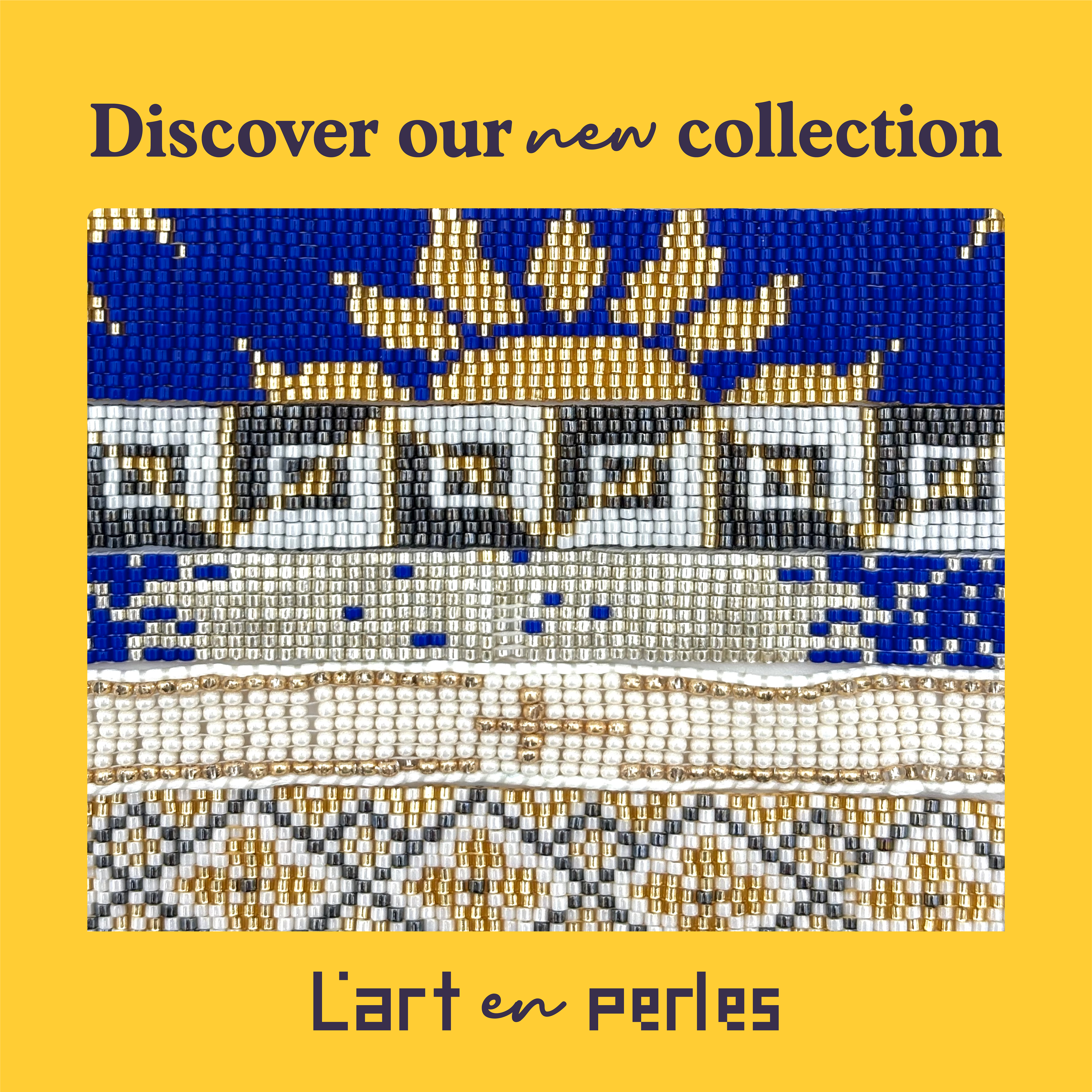
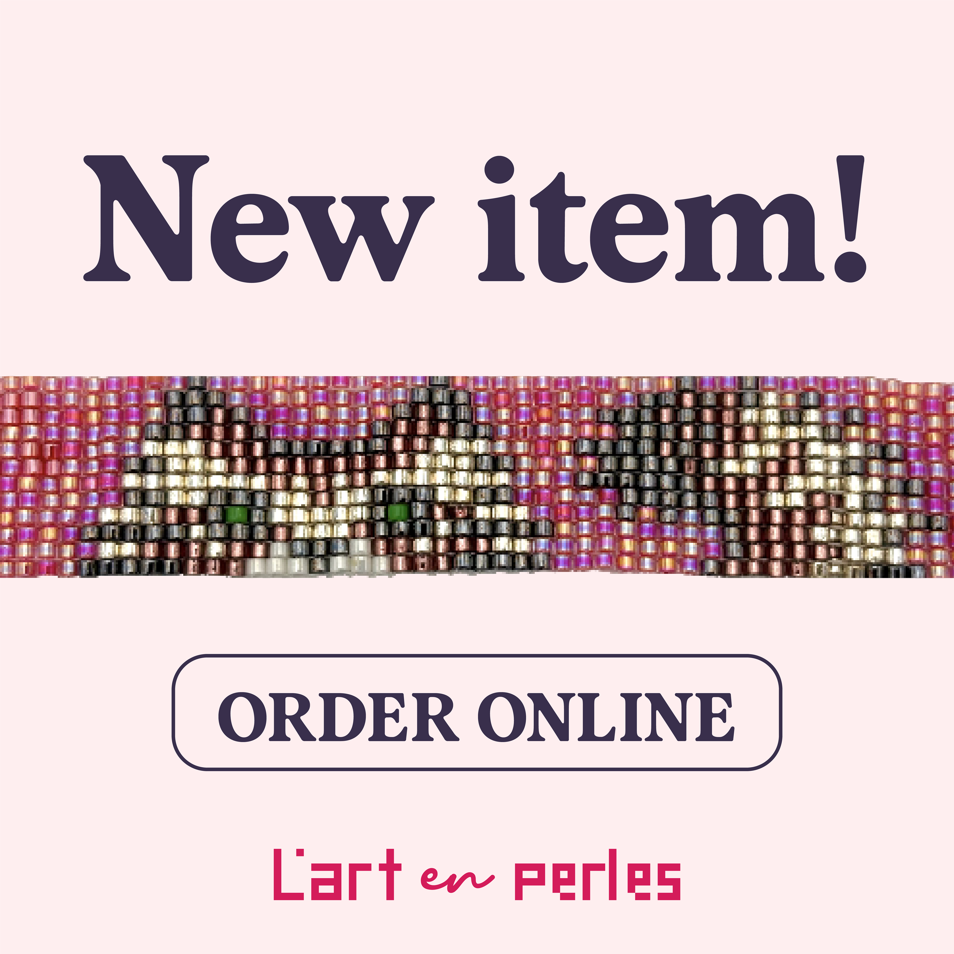
L’Art en Perles (meaning the artistry of beads in French) is a brand for handcrafted beaded loom bracelets. Each bracelet is meticulously crafted using high-quality Japanese Miyuki glass beads. Its brand identity emphasizes the artistry behind the bracelet-making process, while still being whimsical and quirky. The photography for this project was done by Rayan Masry.
The logo consists of the words “L’art” and “perles” typed using rectangles in a grid, resembling the patterns of the beaded bracelets. The same technique is used for the star elements in the Thank You cards at the bottom of the page.
The word “en” in the logo is in the typeface Mairo Regular, a casual script font, reminiscent of the movement of the thread in a bracelet.
Mairo Regular is used in combination with Albra Book Semi and Albra Book Light. Albra Book is a serif geometric typeface with a modern feel. Its perfect geometry and cleanliness contrast well with Mairo’s playfulness.
Palette: L’Art en Perles’ palette is vibrant. It includes different shades of teal and raspberry, aubergine, and sunglow, which reflect the brand’s quirkiness.
Palette: L’Art en Perles’ palette is vibrant. It includes different shades of teal and raspberry, aubergine, and sunglow, which reflect the brand’s quirkiness.


